
InteriorDesign
of the Month

Stone but carefully…
One day I found Frank Lloyd Wright
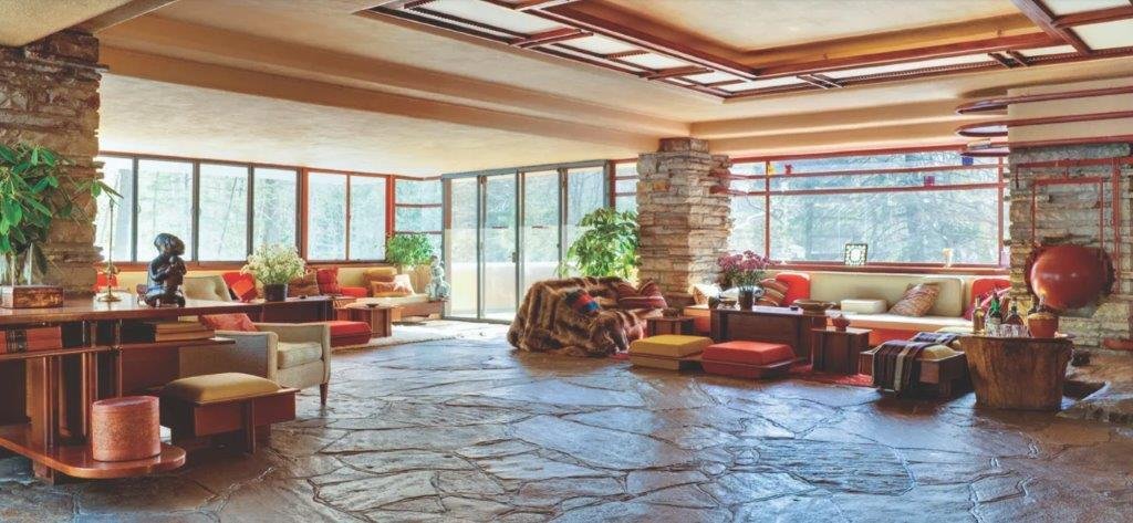
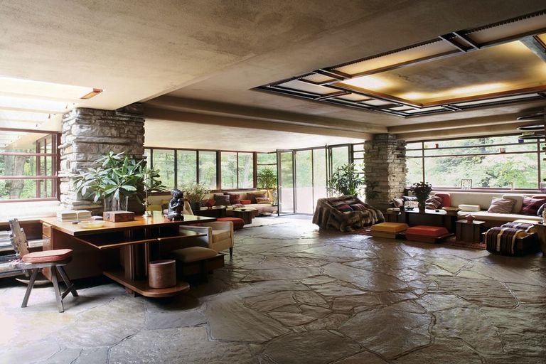
A long time ago I purchased a design book, 20th Century Design from Judith Miller, where I saw a lounge that somehow caught my attention, it was a photograph (below) of a living room from the Storer House (Los Angeles) designed by Frank Lloyd Wright, an American architect and designer that contributed incredibly in these fields with his organic forms, his commitment to handcrafted elements on interiors, his massive open plans, the rustic and natural choices in the selected materials, his Japanese influences…

The point that captivated me was the stone columns with padded details that accompanied and divided the large window and combined so well with the wood in the floor, frames and ceiling joists.
What seemed stone later turned out to be reinforced concrete blocks with Mayan motifs which well-endowed the room with relevance, respect, and serenity; feelings that could come from the halo of sacredness linked in our imaginary with ancient references such as churches, palaces, monasteries, or other constructions with a long past, made to last and with great stories in their shoulders.
After humbly reviewing Frank’s work, it seemed to me that in certain rooms the stone resource is overused, where the blocks upholstered corners and entire walls, overloading rooms and saturating the composition with complex and opaque shapes that do not bring escape and rest points to our sight, which is trapped in overloaded and sometimes suffocating spaces.
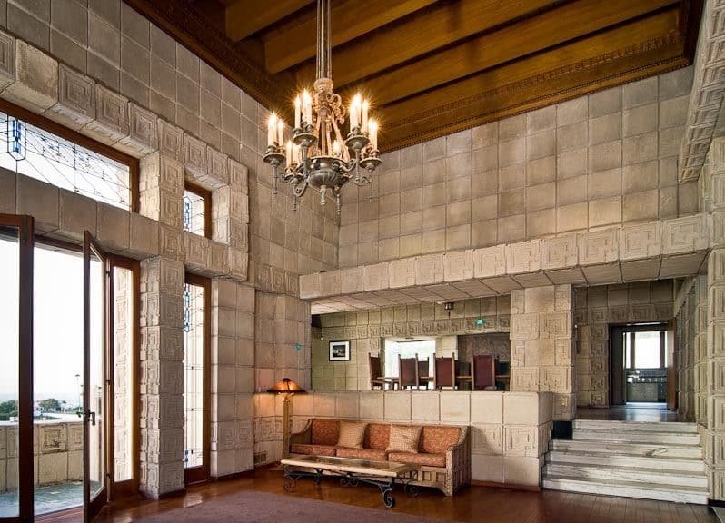
At that time, I understood the wonderful effect that stone (or the stone effect) can produce in interiors, but at the same time how easy is to fall into its abuse if this resource is not properly balanced.
We are going to bring some ideas where I reckon the stone is enriching the interiors.

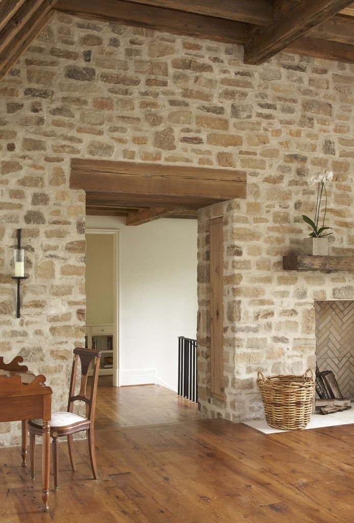
Stone in walls
We are going to see some proposals of what we consider good examples of how stone can be used to cover walls wisely.
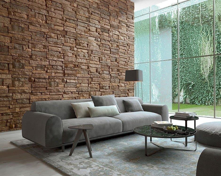
On these lines, we see how the wall takes on a leading role. Indeed, this type of coverage is not one of the most appropriate given the difficulty of its maintenance, as well as the appreciation of the repetition of the tile pattern, since visually a kind of vertical disposition can be traced that let glimpse the tile repetition. The rendering looks good, and we like the choice of the sofas in a colour that gives it prominence and prevents it from being swallowed up by the grandeur of the wall.


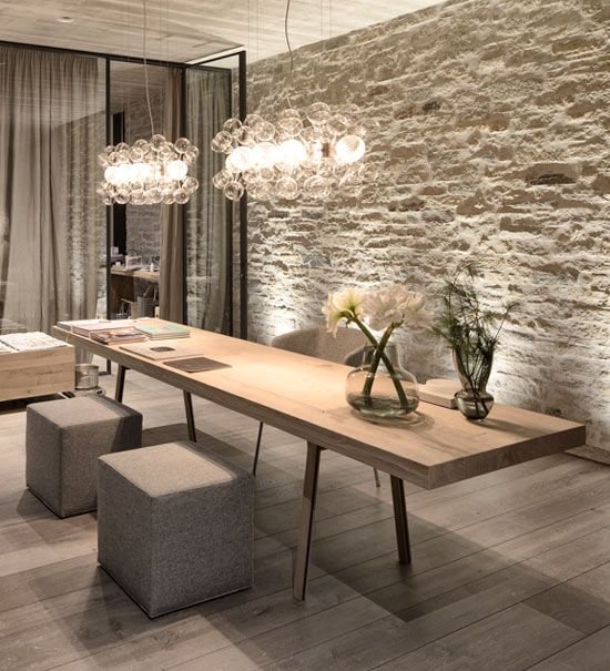
Two more examples of how the wall combines well with the furniture and where the light enriches the profile of the material.
In the photo on the left, the wall contrasts with the furniture without stealing too much prominence and without abusing dark tones.
In the proposal on the right, they succeed in playing only with one wall. A somewhat risky format that is balanced with the simple lines on the ceilings and walls. We observe how well the adhesion of green tones suits him, a widely used resource in the current trends.
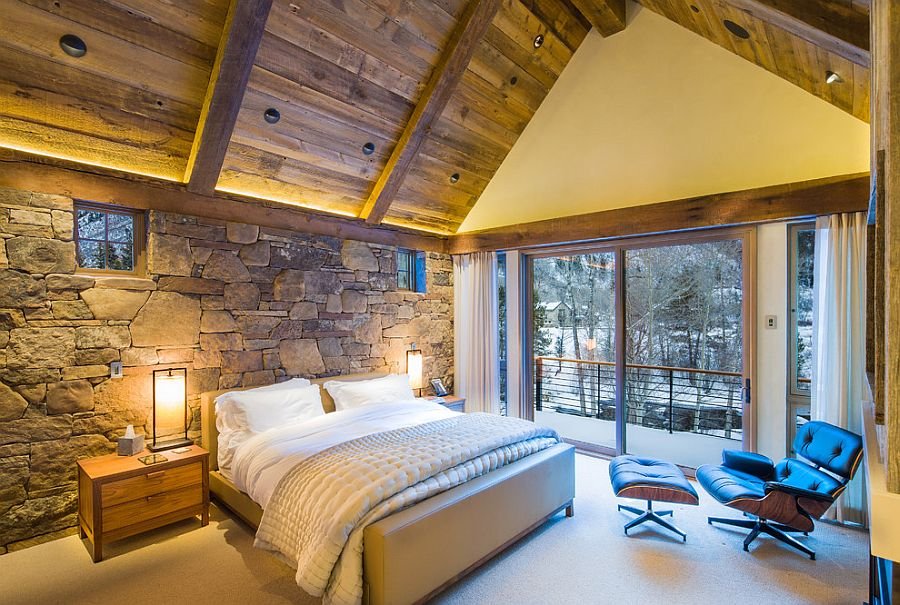
Here we have a more rustic finish that allows us to admire the wall strength without saturating the whole piece, reaching the balance thanks to the longitudinal window with a smooth white portion on top that softens the room.
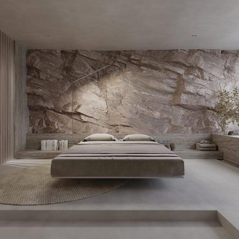
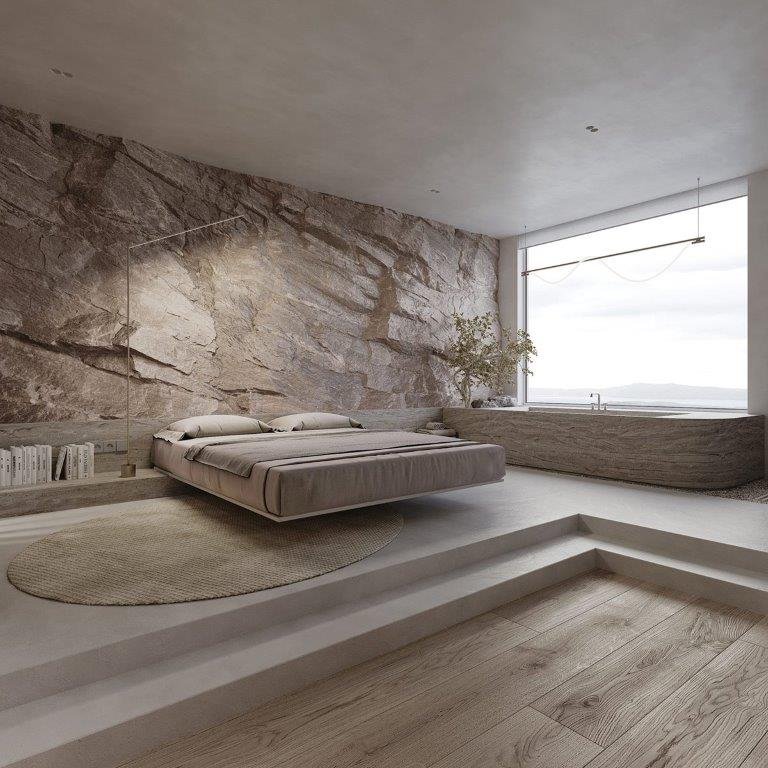
Incredible the proposal that we see in the two images above where the designer gives himself the pleasure of being able to choose an spectacular wall with a soft colour that stands out for its wild profile. This is in perfect harmony with the furniture and the bed without taking away their prominence… it is a 3D render, so everything adapts to the artist’s wishes.
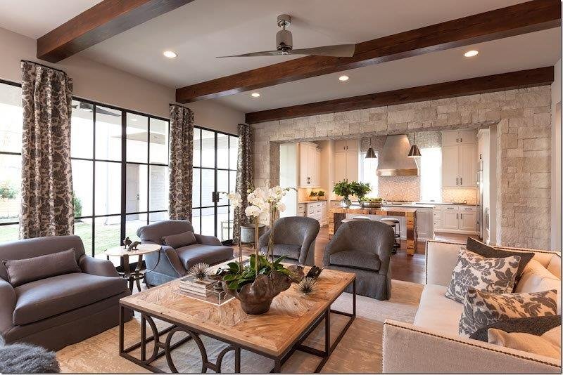
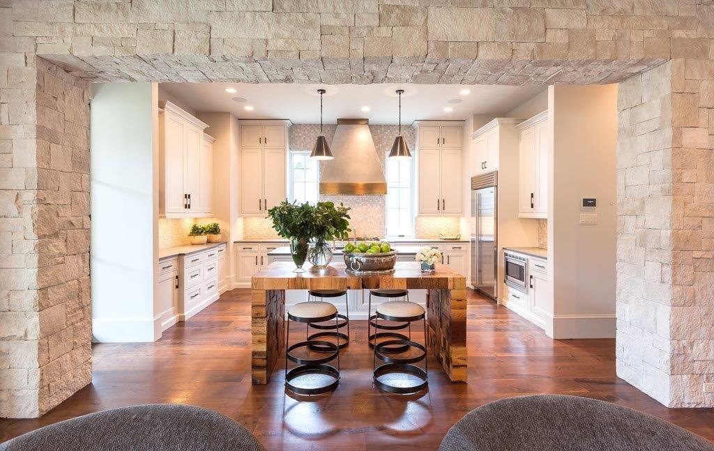
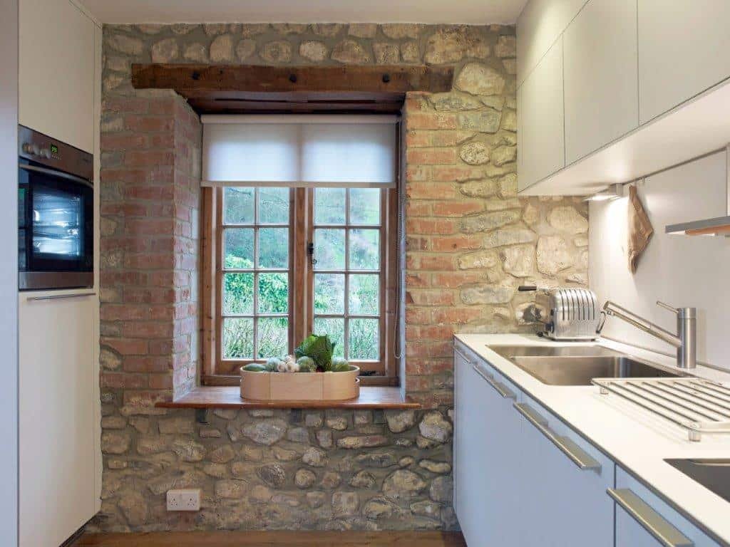
I like this proposal; the stone is used but only in the arch that separates the kitchen from the living room. We believe that they have wisely succeeded in using this resource as something punctual, orchestrating it with wooden beams, smooth white walls and ceilings, and the company of a large window (shoji style) that offers the needed rest so the stone it’s in balance.
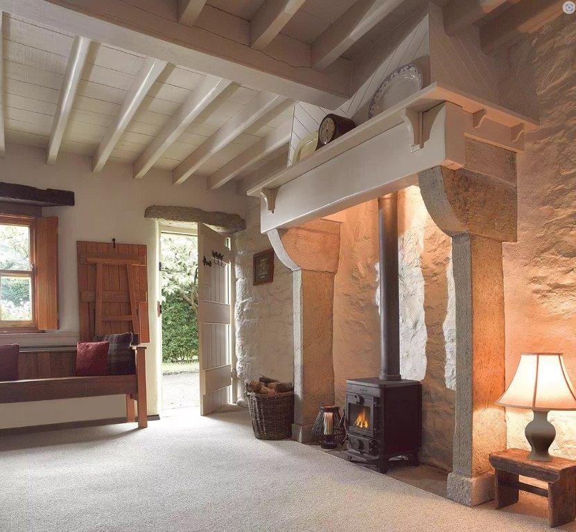
This transition is wonderful, the wood dissipates its color through the bricks that ends up fading with the stone in a very harmonious way, ending in an unpretentious plain white kitchen that does not compete but accompanies, leaving the wall as the clear protagonist of the room. The stone, not being dark, favors the composition and better distributes the light in the whole.
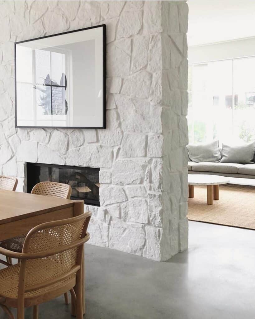
The three photos above exemplify how a stone wall painted in white could work if it is properly accompanied by other elements that also seek their prominence.

Here we have some walls that have been softened with plaster to reduce the color and thus achieve softer tones making them better and easier to furnish.
A final example of a combination of a stone wall with a rather prominent profile and a shelf built into the wall. We think it is interesting how the profile of the stone is better appreciated when combined with the linear wall.
Stone in baths
Time to see some bathrooms that can give us some ideas of how stone touches could make these “usually” smaller rooms great. On certain occasions, we will see that rectified cement tiles are used to emulate or mimic stone tones and reflects but I think it serves to depicture the intention.
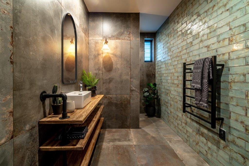
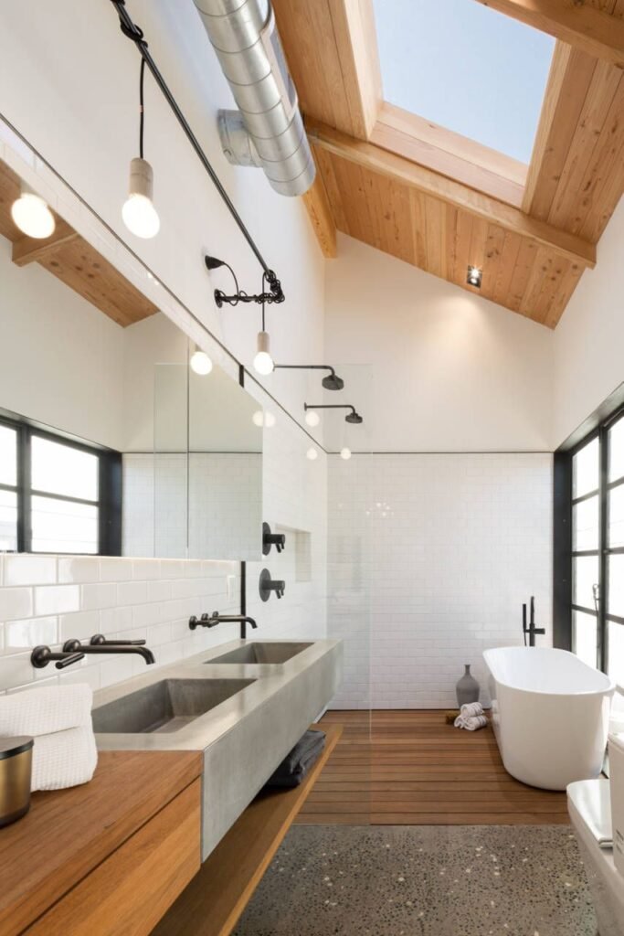
A more industrial design proposal with noble wood shelves that give the sensation of being suspended in the air thanks to the pipe shelving brackets that look great.
We observe that to alleviate the opacity and predominance of the cement slabs, once again the resource of wood and green was chosen.
I would like to note that the sink looks good but it is quite uncomfortable since whoever uses it will always end up leaving the wooden shelf wet, where the porcelain piece must be also well sealed if they want to avoid some woodwork from time to time.
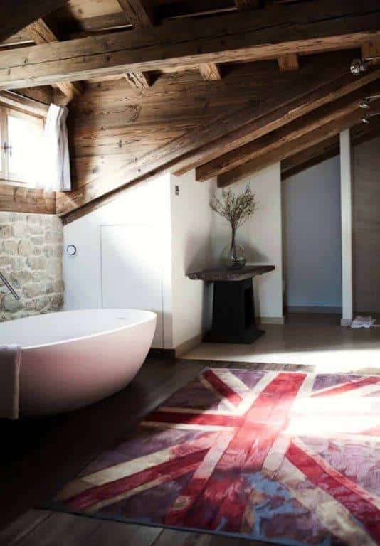

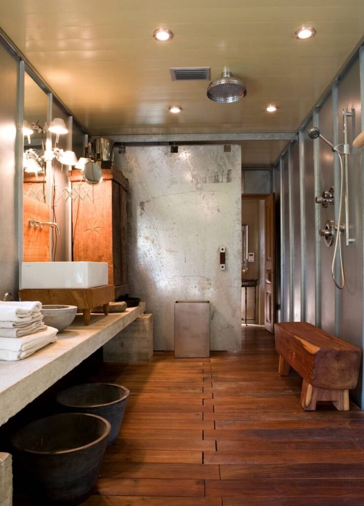
A more complex and more elaborate proposal that, as a result of the quality of its materials, its successful but risky combination of formats, make this a timeless bathroom an example of durability, comfort and elegance.
It is true that the shower repeats materials and tones on the floor, ceiling and walls, which can cause a certain monotony and burden, but it rightly breaks the trend by including the central mosaic of ocher greens and whites, a large glass front in two sheets and a set of handles and taps in chrome.
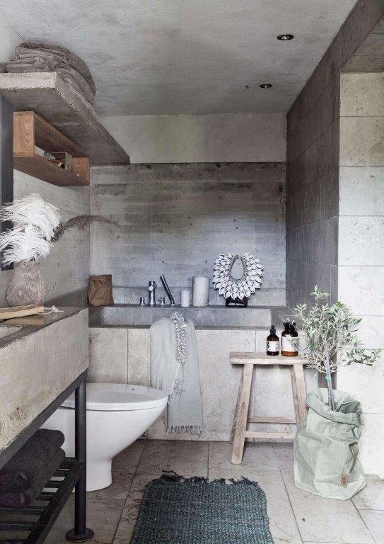
We love how natural, soft and timeless this bathroom looks, with those incredible stone slabs in combination with what appears to be whitewashed wood on the wall.
The sink is spectacular, and the floor is built to last. The ceiling seems to have been aged and the toilet would be the only one that deserves a change.
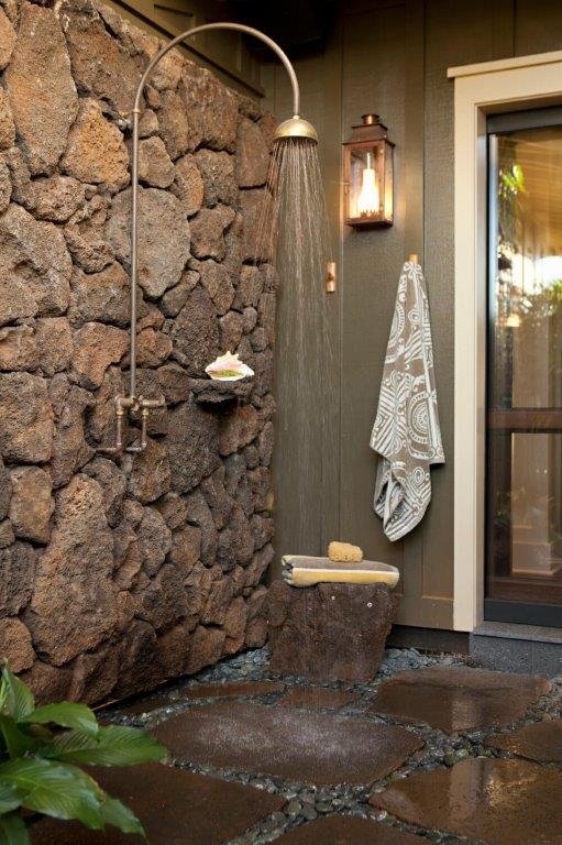
This is a shower with character. The stone is spectacular and once again combined with a green wooden wall.

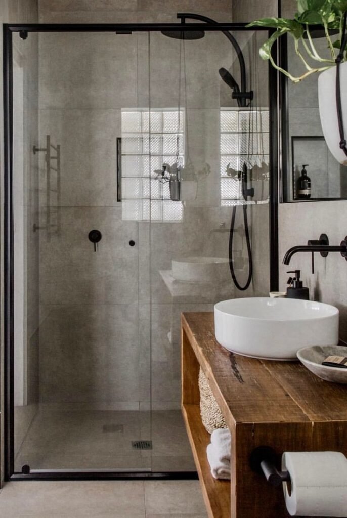
We love wide sink… it might not be stone, but it gives us the same feeling and we like it!!. I love the mixer tap and the idea to have both sinks in the same cavity or separate ones if they are as bigger as the below photo…
I love the above combination, stone/ concrete, hardwood, ceramic and chromed elements all in sync…ignoring the craziness of the proposal as particularly I do not like that kind of shower where all is splashed, the flooring next to the sink gets wet and gives you the weird feeling you are getting a shower in the middle of the corridor…
It’s catchy the black notes over the stone tones that might have a cold feeling, instantly broken by including an aged hardwood box as a washbasin cabinet
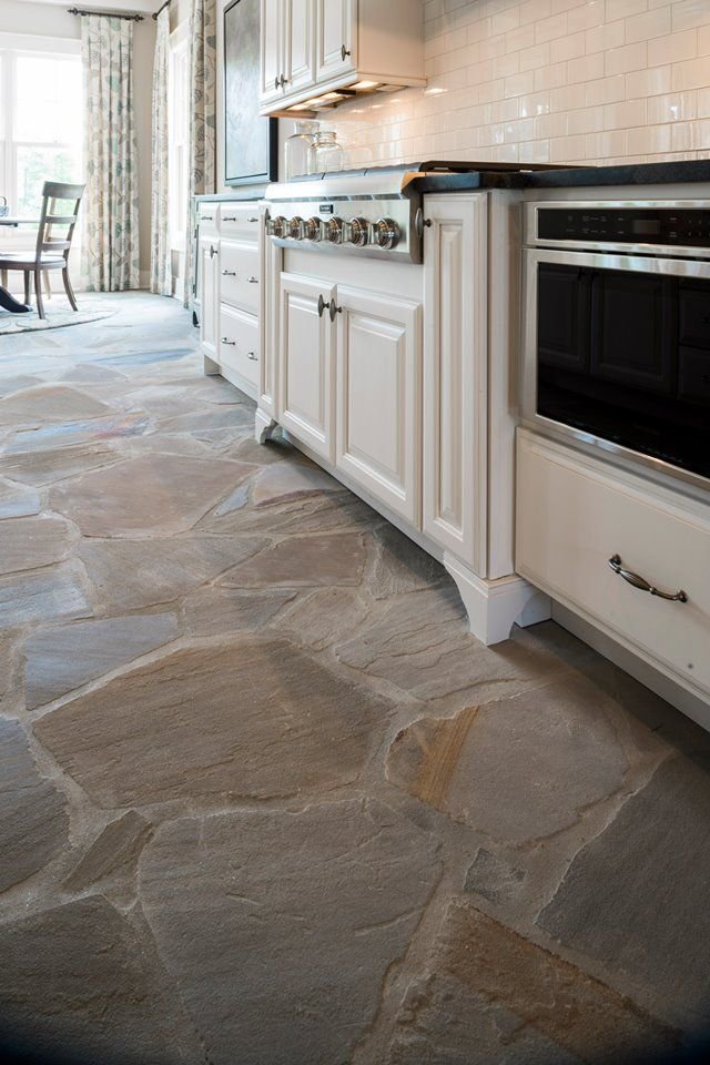
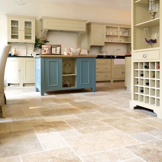
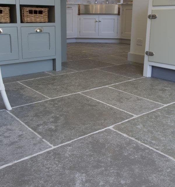
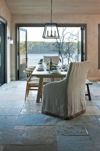
Stone in floorings
Once again, we revisit the Franks’s work to convey these ideas. In this case we want to highlight this amazing stone flooring.
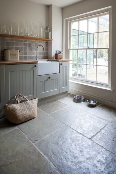
Lovely stone floor with a low profile to make it available for barefoot walking.
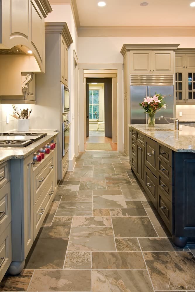
The nice and complex floor that relegates the simplicity to the furniture that plays an always winning choice of colours mixing beige, greenishes tones, aged whites and chromes.
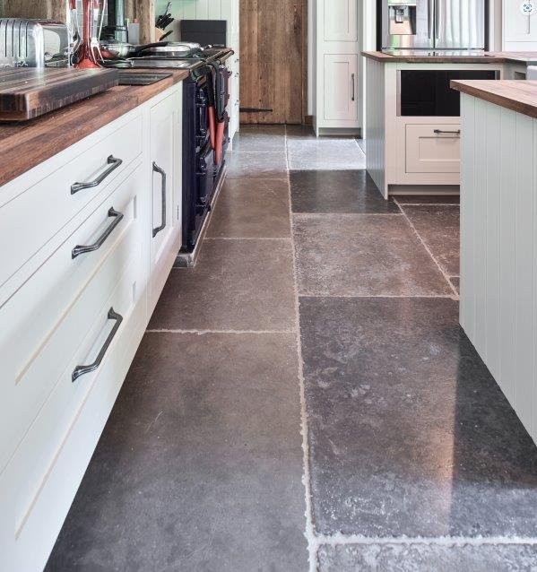
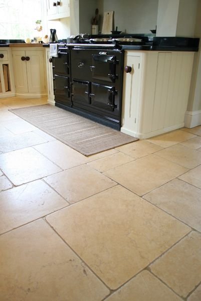
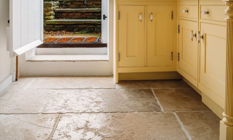
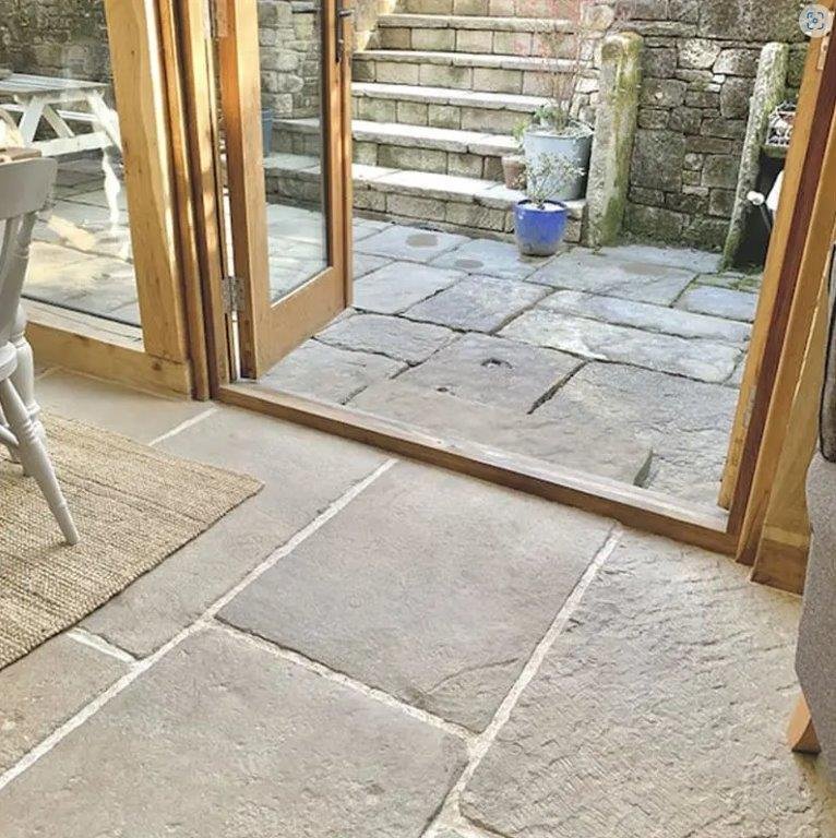
We are going to see below other stone floorings that we reckon are awesome.

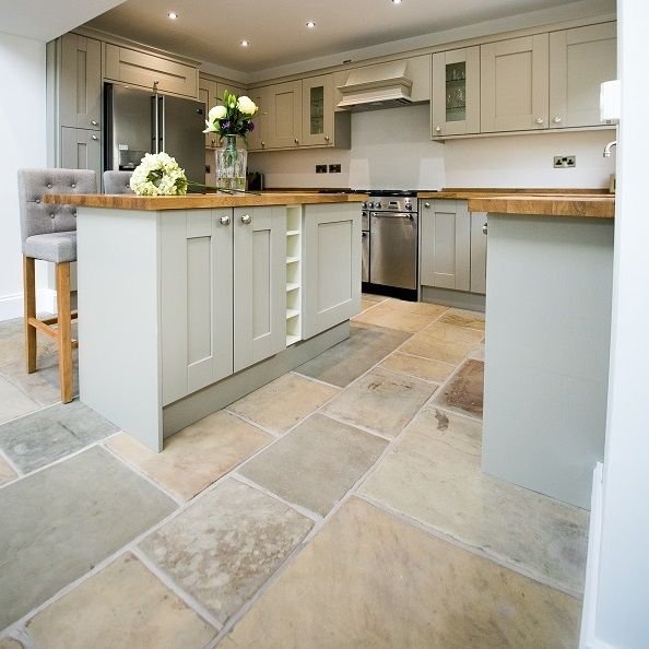

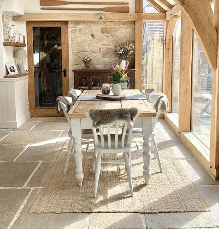
The lovely proposal combines stone on the floor and the wall, but all the time relaxing the view with white elements and nice soft light wood beams.
Did you like the proposals we brought you here? …Leave us your thoughts in the comments section below.

Miguel Angel Torio
HandyTales Founder & CEO


Hey hey! Gamef88, eh? Worth a peek if you wanna try something different. Jump on over to gamef88
CalupohCasino is worth checking out. It has a clean design and decent payouts. Might be your new favorite calupohcasino.
Luckyph, well, let’s see if it lives up to its name lol. Okay, it keeps me busy and the features are nice! Maybe this will be your lucky day luckyph.
Alright, so I stumbled upon 777kingcon and gave it a whirl. It’s got its moments, you know? Worth a look if you’re bored. Check it out yourself: 777kingcon
Fancy a spin on the roulette wheel, eh? Casinorouletteonline looks like they’ve got a fair few options. Worth a look if you’re after that casino buzz. Check out casinorouletteonline when you get a chance.
Casinoplusace… hmm. Has anyone had a good run there? Always on the lookout for a new spot to try my luck. Let me know if casinoplusace is worth a go.
G’day! Heard a few whispers about 12345jili. Anyone striking gold there? Slots look pretty tempting to be honest. Take a punt with 12345jili, maybe you’ll win!
69vncom. That address has a ring to it. I’ll probably take some time today to give their betting services an actual solid assessment. Here’s the link: 69vncom
VN69bet – heard that name! My mate was raving about how easy it is to navigate… If it’s as smooth as he’s saying, it’s worth the checkout: vn69bet
Yo, j9app! Just checked it out. Pretty slick interface, and the game selection is seriously impressive. Definitely worth a look if you’re hunting for a new spot. Check it out here: j9app
Noho NYC – something related to North of Houston Street. I’m from NYC. Gonna check it to find some local gems! Check it out yourself: nohonyc
4777cx? Oh yeah, solid platform. Easy to navigate and a good variety of stuff to do. Worth checking out if you’re looking for a new place to play. More info here 4777cx.
I stumbled upon 7cxgame the other day, and I’m impressed! The graphics are slick, and the gameplay is smooth. Thinking I might stick around. Give them a look see 7cxgame!
Alright, blue100novibet, just gave you a whirl. Site’s snappy and the games are pretty sweet. Hope my luck holds out! Check it out blue100novibet.
Lucky67 – Tried my luck there and actually had a surprisingly good run! Maybe it really is lucky. Give it a go and see: lucky67
Plusphcom! Its got a certain ring to it, doesn’t it? I had a decent experience last time I used it. Why not give it a shot? See for yourself: plusphcom