
InteriorDesign
of the Month

Black is powerful if properly used…

This month we are going to review some interior designs with some black choices in their repertoires… a shade that generates certain challenges, which if well resolved, the interior will be touched by its gifts, but if the challenge is not overcome, a monotonous environment could be the result of its excesses …unpleasant, stressful, pessimistic and tiring feelings in the day to day.
Black does not reflect light…, white otherwise is the shade with more luminosity, and yellow is the lighter within the primary colors….therefore we have one that absorbs light and white and golden tones that lit the scene sharing their light balancing the black’s needs and producing a proper environment for the black to open its inner qualities such as elegance, sophistication, status, intelligence, prestige, power to name a few…
Gold causally shares some of the black’s features as sophistication, status and prestige but also adds luxury, quality, and prosperity.
Donald Hoffman, professor of cognitive science at the University of California, says that chromature targets the human emotions more specifically than uniform color patches… therefore gold will ignite something more specific and complex depending on the observer. In this episode we will bring not just some chromed gold touches but also some other hues from yellow to dark oranges including wood tones that help the composers to balance the black bringing warm and live-nature feelings.
White will offer calm from the black’s excitement, adding cleanliness and purity to the composition.
Please have a peek at our selection and we will discover together how these artefacts are more frequent in composition than initially one could imagine.
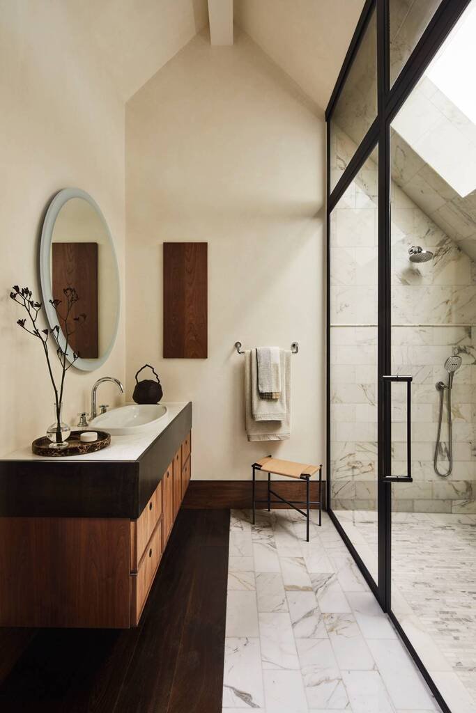
Smart and simple set of materials that play well in the composition where the black window breaks abruptly the white shower and somehow the composition accepts this interruption in the white monotony and warming the stay with a risky dark wood on floor transitioning to lighter one in the bathroom furniture. The stool helps in midway the transition by stretching hands with an intervener tint of the orange hue…
Elegant touch on sliding doors that reveals the balance with the white duvet that it is also visible through the crystal to keep equilibrium even closed. Four golden light-points complements the black to add luxury tones. Eclectic leather on floor that routes black to white. Peculiar cabinet on the right might add mystery and elegant eccentricity to the picture.
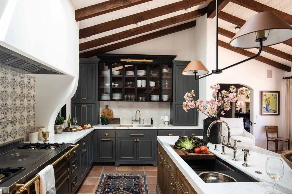
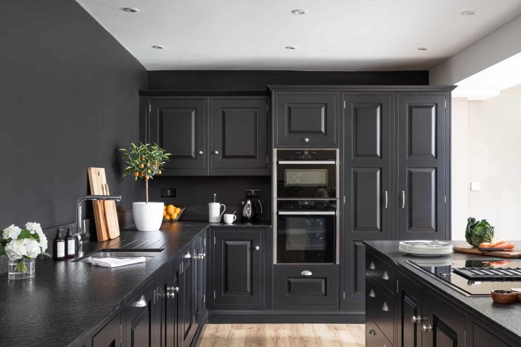
Formidable kitchen awarded by a beautiful spacious room, leaving in this case the black just to play shyly with the white crockery, the lamps and the vase. The golden notes are reflected on knobs, rails, floor, beams and lamp shades which will become more important as soon as the ambient light dims.
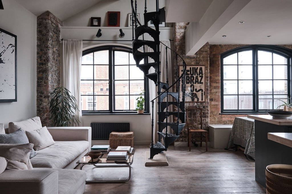
Here we have a more rustic finish within the city. Great brick touch combined with white walls and touches of black and edged wood. The black here is directed to rightly highlight rounded and wide windows, heater, kitchen and an epic iron stair case breaking monotony and strengthen its industrial look. The sofa and flooring moves away and leave the blacks to play.
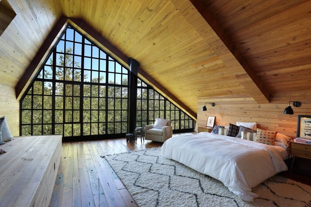
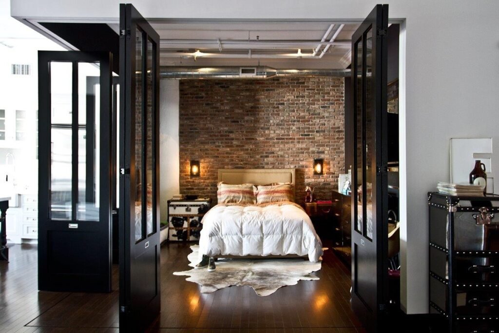
Above an incredible golden grotto with an incredible black-shoji-pyramidal window that brings sophistication to the scene. A composition that also applies a balancer in the white bed and a midpoint in the carpet.
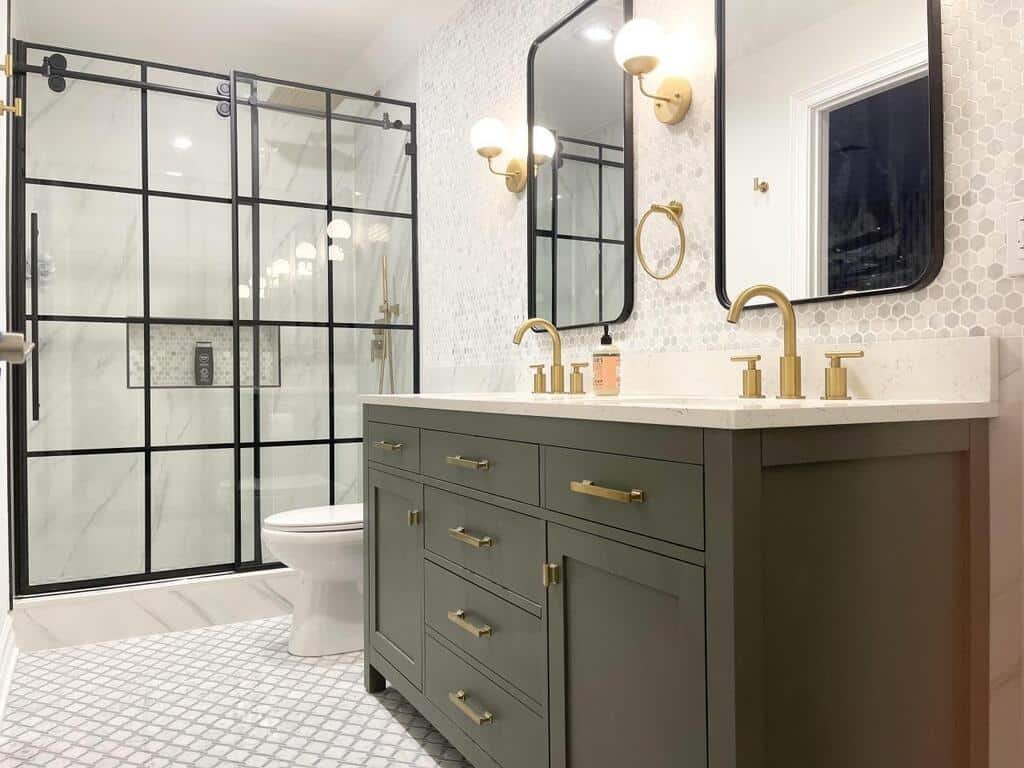
Another example well played between White, grey, black and golden chrome touches to bring luxury and quality feelings. We love the way of highlight with black the latticework of the bathroom screen and the inlay of the shower intrusion.
Another way to take advantage of the resource of black to distract the eye from the color disorder and focus it on a more harmonious point.
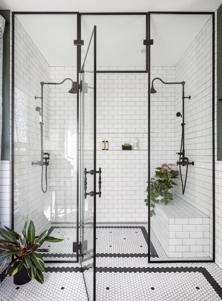
Amazing shower, how well decorates the mosaic floor and how wonderful is the fixed crystal panel. No gold this time…imagine including the shower towers and the knob of the glass door in golden chrome… Would this improve the composition? Please leave what you think in the comments.
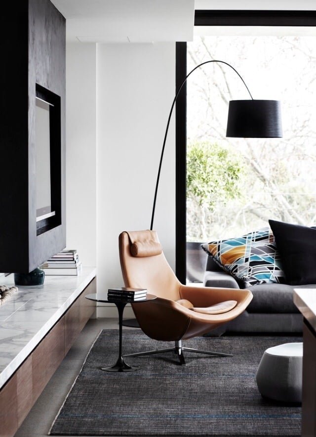
Amazing armchair that harmonizes the aggressive fight between black and white…
Now we are understanding better pieces like the above…
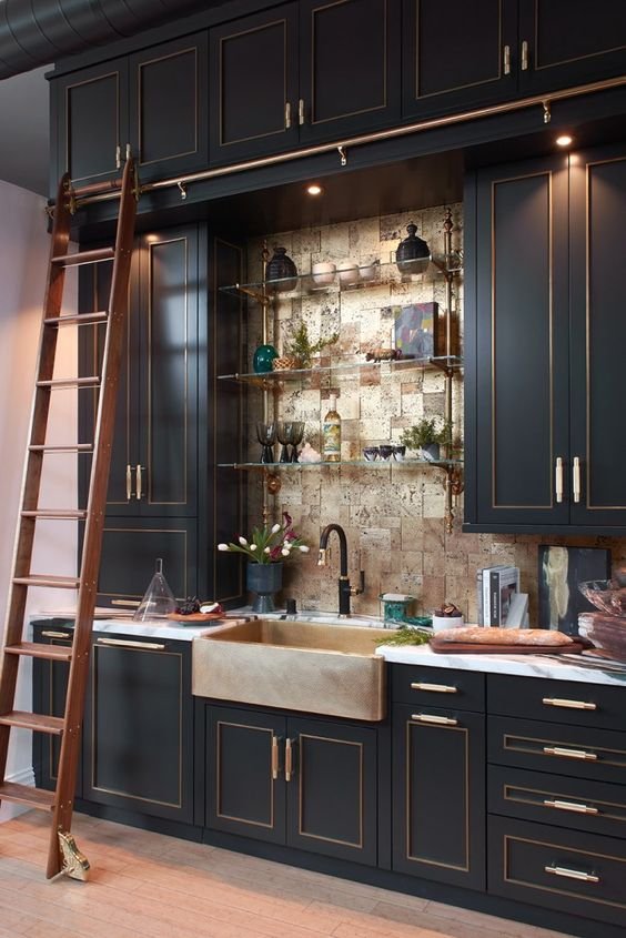
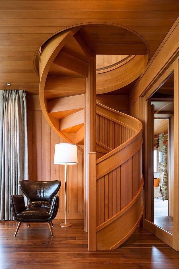
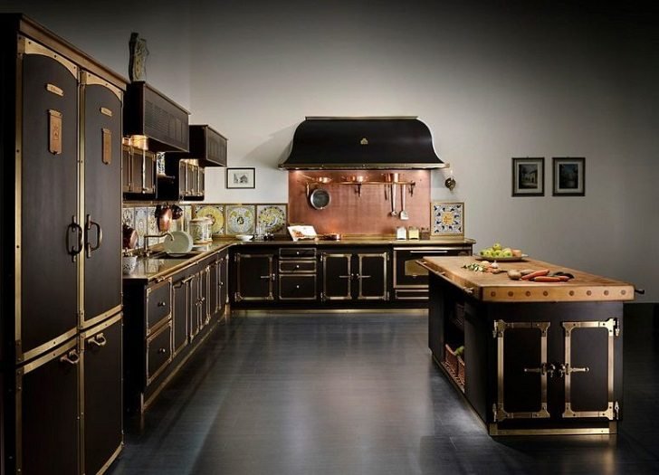
Very interesting old-school sink surrounded by black furniture with copper inlays and knobs to reflect personality; strengthen by an uncomfortable but sympathetic staircase that will make the final user remember the mother of the interior designer occasionally.
The center wall matches the sink but brings excessive complexity to the set making the kitchen messier than it really is.
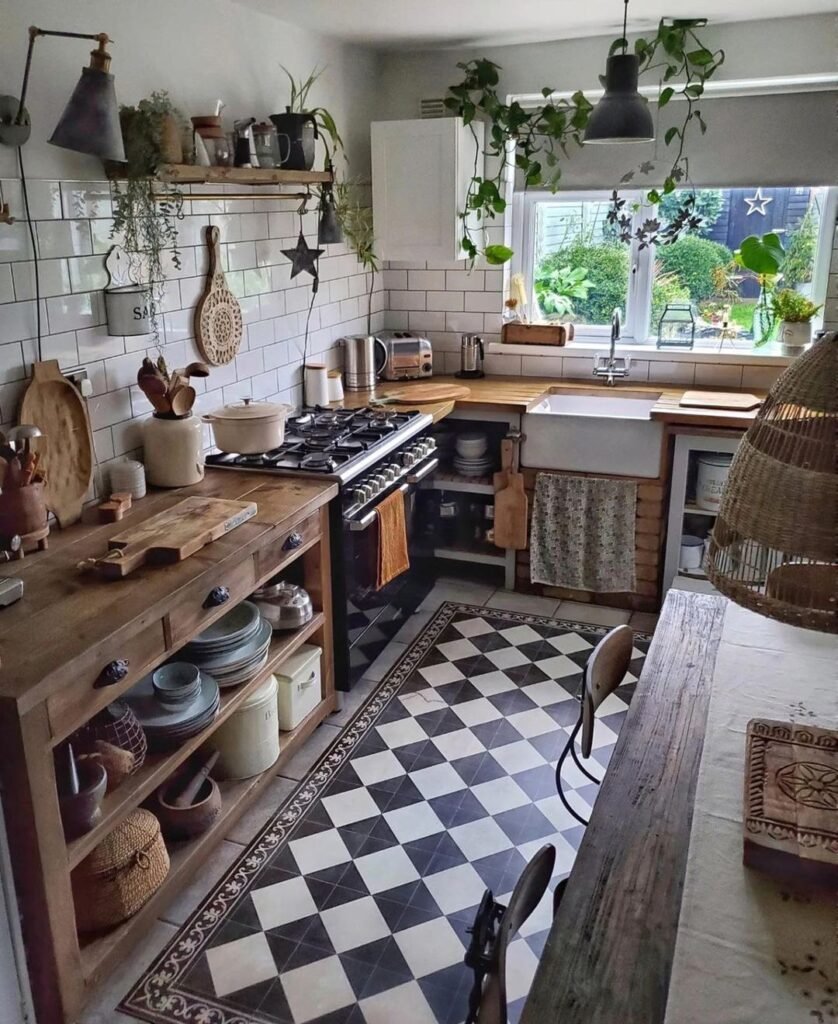
Rural and fun that harmoniously covers the checkered floor.
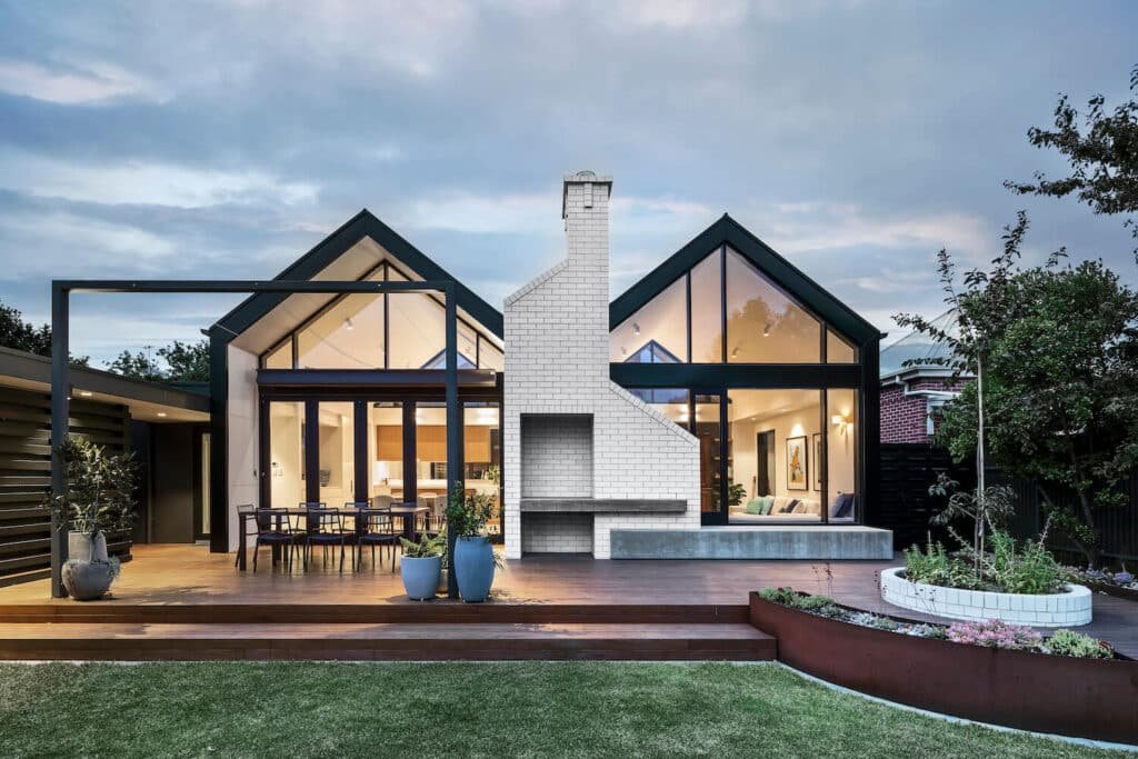
The same theory applied to a house exterior where the gold stands in the tungsten lights.
Great way to create a room without reducing light in the corridor and also creates an intelligent space with sophistication.
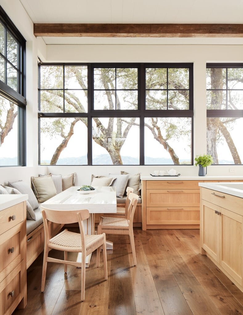
It seems the combination with light wood is a better choice, although even better if the wood furniture feels less industrial and homogeneous…the floor looks a success to me.
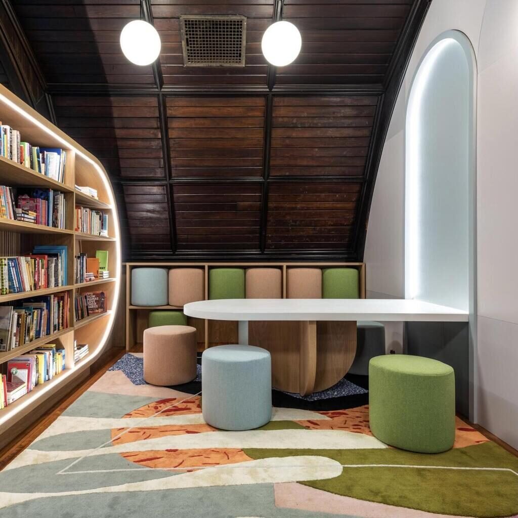
Playful and fun room that would get some benefit is the wooden slats on the ceiling were made of a more luminous wood.
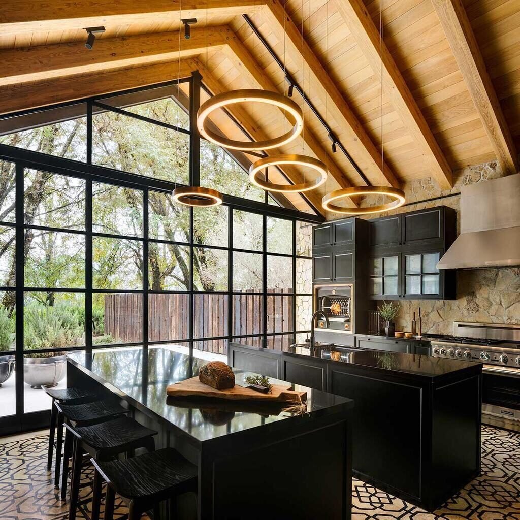
Spectacular stay rescued by the golden lamp and ceilings that try to balance the excessive use of black that does not feel helped enough by an intricate floor with also black inlays.
Above we can see something goes wrong…the black masks everything removing any kind of protagonist where the elements of the kitchen go unnoticed…and the floor which should be the saviour of this movie; worsens the composition.
Another example about the effects of a black overdose not balanced enough could produce.
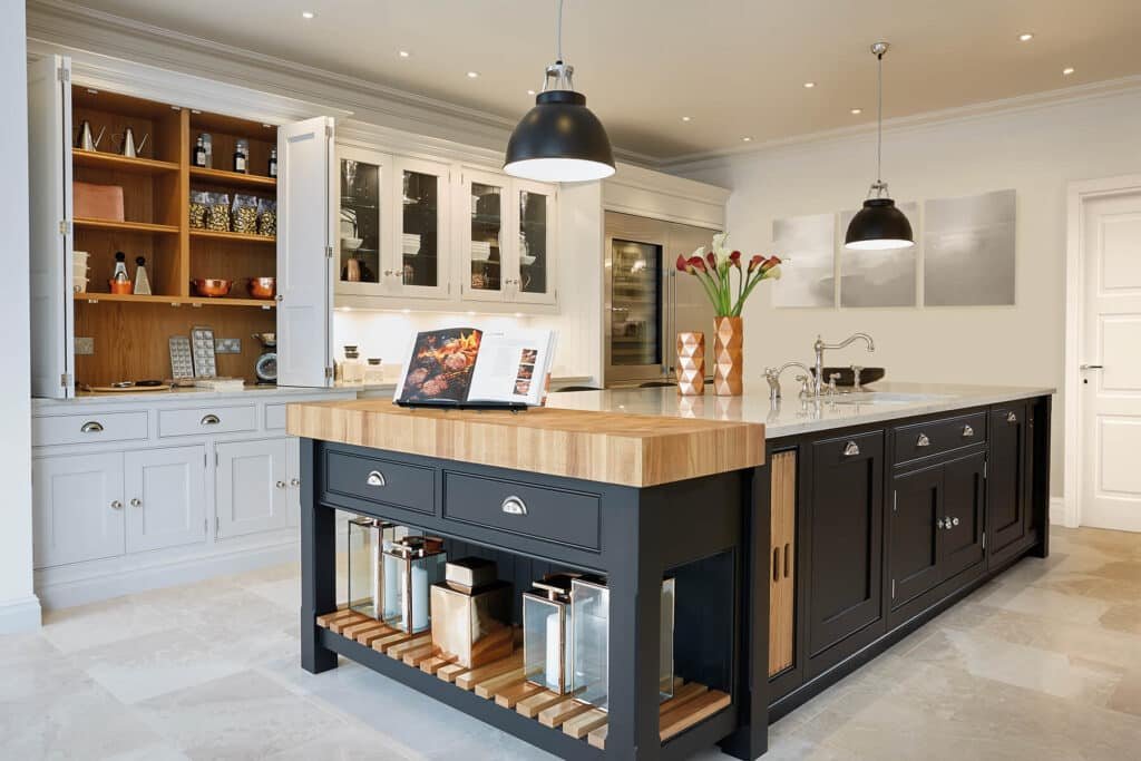
Beautifull isle well balanced, although we do not understand why the sink is far from where the crockery is stored. The interior of the wall furniture does not convince.
This kitchen is very special as the furniture is incredibly stylish, but the floor is not doing its job as balance neither the empty walls or even the lack of presence of light sources.
The room despite has an elegant, powerful and gorgeous set, feels empty.
I reckon this is a good exercise about compensating the black properly.
Did you like the proposals we brought you here? …Leave us your thoughts below.

Miguel Angel Torio
HandyTales Founder & CEO


123winvin alright, another site with ‘win’ in the name. Hope it lives up to it! Gotta check my luck there: 123winvin
Yo, ditch the computer and get the 77betapp! Smooth as butter and all the bets you could want right in your pocket. Download it now 77betapp
Hey guys, quick heads up about 92star. Been using it for a bit and it’s been working great. If you’re looking for something similar, give it a look: 92star
Decided to give hello88bet a whirl. Registration was easy peasy and the site is pretty clean. Fingers crossed for some wins. You may want to give a try. hello88bet
Sv66c, sounds kinda techy, which is cool. Could be a sign of a modern platform. Worth a peek to see what they’re offering. Might find your next favorite game there. sv66c
33win44, that’s a catchy name! Gives me those good luck vibes. The site design is nice, and the game selection is pretty good too. Give it a go, see if it’s your lucky number! 33win44
Alright, fb88gay’s marketing is def something else. Not my thing, but hey to each their own. If you like what you see, then go for it. fb88gay
Alright, gotta give a shoutout to ZALVCOM! Their site loads super fast, and the games are seriously addictive. Give zalvcom a go. You’ll be hooked in no time!
Just wanted to share – I’ve had some awesome wins on ZALV888! The bonuses are generous, and the customer support is super helpful. Highly recommend trying zalv888 if you’re after some good wins!
Hey everyone! ZALV88 is my new favorite. Easy to use interface and a wide selection of games, what’s not to love? Give zalv88 a try, you might just find your new lucky spot!
Just signed up for Sumclub30, and I’m diggin’ it so far. The games are smooth, and the bonuses seem pretty generous. Hoping to hit a big win soon. Watch this space! sumclub30
Downloaded the Vn23app on my phone, and it’s pretty convenient. Can play my favorite games on the go now. Graphics are good, and it runs smoothly. Check it out if you’re always on the move! vn23app
Downloaded the betobetapp and it’s smooth. Easy to navigate and place bets. Seems legit so far. Hope I get lucky! betobetapp